Map design for realistic spaces is something I love doing and have managed to build a decent career around and over the years I have discovered some tricks and general rules to follow. I have also developed a few primary methods of map design that I use. Single player maps pretty much require solid planning and lot’s of forethought to layout so that AI and desired mission objectives can be included. But Multi player maps lend themselves to more freedom and flow.

When designing MP maps I will sometimes do a meticulously planned layout on paper, gathering various references and building mockups. However, some of my best map designs have come out of a free flowing “freestyle” process without much prior planning before building. I will start with a general idea from something that sparked my interest or something I saw one day and just sit down in the editor and start building. Of course I have a general idea of the overall feel of the space going in, but due to the free form nature of the process things will change and evolve as I go. For example, I might have an embankment then realize a sewer pipe underneath would make for a great secondary route. I move through the space and think like a player and make changes based on how things look and feel from “ground level”. For you old schoolers out there…. CityStreet Large, Killhouse Double and Trenches from the Red storm games were all done this way.
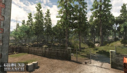
I just started a new map this way based off a cool looking radio tower that is next to one of the places my son plays Ice Hockey. I was standing in the parking lot looking at it then at the surrounding area and realized that there were some neat aspects to the space. So that sparked some imagination. Unfortunately, I can’t seem to go through life anymore without thinking how a space would do for a game map. 🙂 So I took some pics and started messing in the editor. One nice thing about having a good bit of assets created is the ability to use them, and not just “grey boxes”, when roughing out a space.
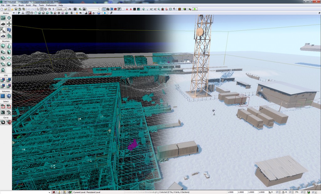
This map will be the first playable that people will get to play in once we do a public release so you will get to see it evolve. It will change over time but will be a good place to work the bugs out of the game and you will see more of it in blog posts as we go.
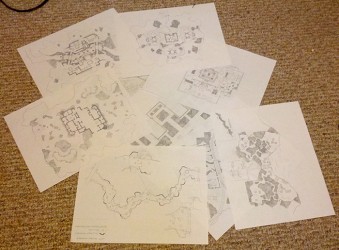
Oh, and there are lots of possible map designs on paper that may or may not be included in Ground Branch. Solid gameplay must be completed before going headfirst into map production so we have a better idea of what will work and what won’t before wasting time on art production. So rest assured, Ground Branch will have top notch maps.



Join our
Receive our updates
Connect